Customer Feedback Form That Converts: A 2026 Guide
How to build a customer feedback form that people actually finish — question order, length, logic, and turning answers into reviews.
In this article
Most advice about a customer feedback form is too narrow. It treats the job as a writing problem. Ask fewer questions, use a rating scale, keep it clean, and you're done.
That advice isn't wrong. It's incomplete.
A form can be short and still fail. It can look polished and still collect weak input. It can generate responses and still create no business value because nobody turns those responses into decisions. In practice, the form is only one part of the system. The primary work is reducing friction at the moment of response, choosing the right format for the customer, and making sure the answers become usable insight instead of another spreadsheet nobody wants to open.
Why Most Customer Feedback Forms Fail
Companies don't struggle because they forgot to create a survey. They struggle because they built a collection mechanism, not a feedback workflow.
That distinction matters more in 2026 than it did a few years ago. The global Customer Feedback Software market is valued at $2.26 billion in 2026 and projected to reach $6.89 billion by 2035, according to Global Growth Insights' customer feedback software market report. Businesses aren't treating structured feedback as a side task anymore. They're treating it like operating infrastructure.
The form usually isn't the real problem
A weak customer feedback form often shows one of three issues:
- It asks for too much too early. People see effort before they see relevance.
- It collects answers in a format customers don't want to use. Mobile visitors don't want to type paragraphs with their thumbs.
- It ends at submission. Teams gather responses but never synthesize them into themes, product fixes, or marketing proof.
The result is predictable. You get shallow ratings, vague comments, and a backlog of unread open text.
Practical rule: A feedback form should help you make a decision. If a response can't influence product, support, onboarding, messaging, or trust-building, the form is collecting noise.
Collection is easy. Action is harder
A common sticking point for many teams arises here. They optimize the top of the funnel for feedback but ignore the middle and bottom of the process. Someone adds a CSAT field, someone exports responses, and then the work stalls because nobody has time to read everything carefully.
That's why the most useful way to think about a customer feedback form is as a pipeline with four parts:
| Stage | What good looks like | What usually goes wrong |
|---|---|---|
| Request | Sent at the right moment, with clear expectation | Sent late or to the wrong audience |
| Response | Fast, low-friction, mobile-friendly | Too much typing, too many fields |
| Analysis | Themes, patterns, and quotes become visible | Raw comments pile up |
| Action | Teams change product, support, and messaging | Nothing closes the loop |
When teams only focus on the form itself, they usually optimize the smallest part of the problem. A customer feedback form that converts isn't just one people submit. It's one that produces usable input you can act on quickly.
Designing a Form People Will Actually Complete
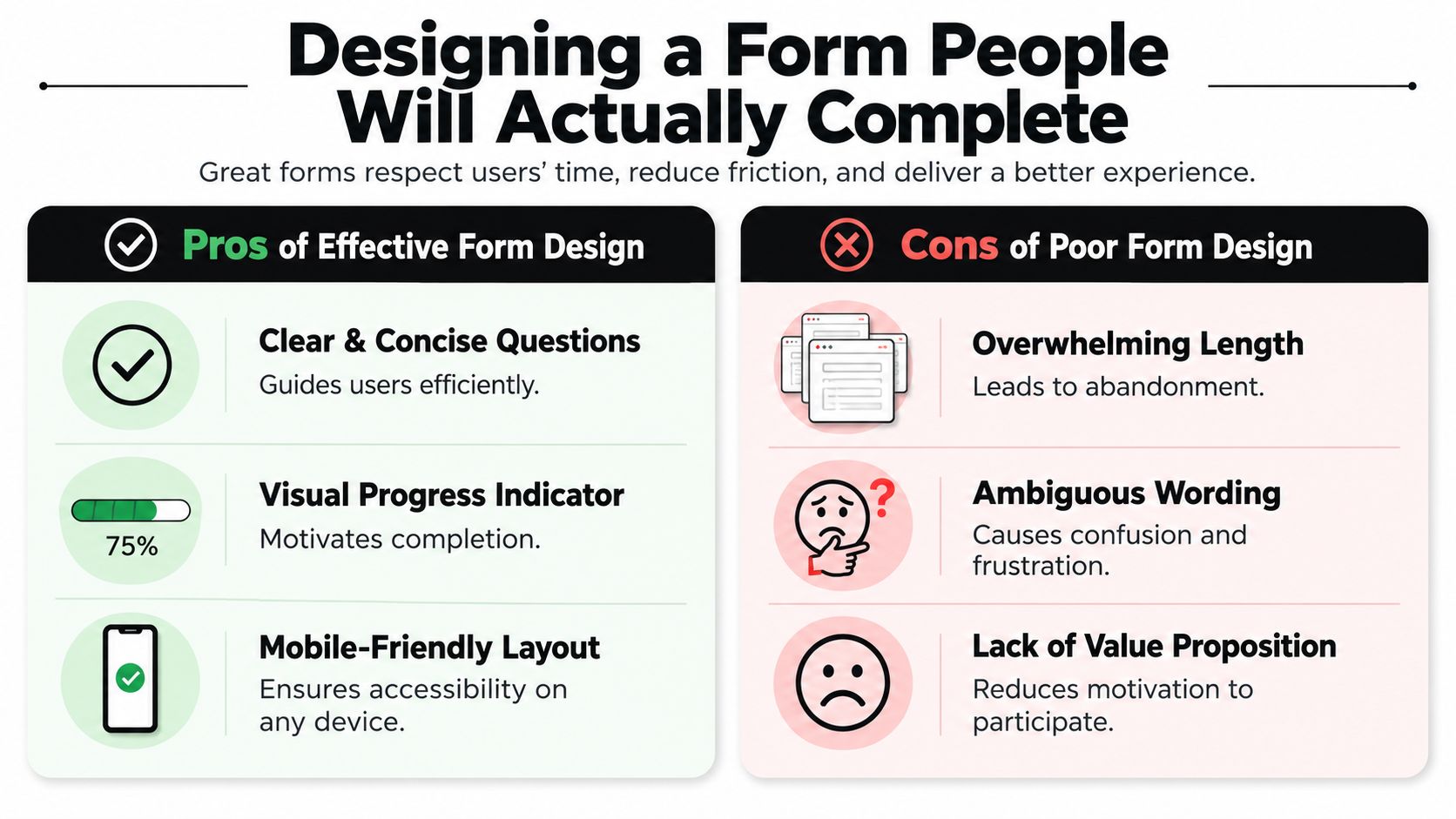
The fastest way to lower completion is to build the form around what your team wants to know instead of what a customer is willing to do.
The better approach is to design around effort. Every field adds cognitive load. Every unclear label forces a pause. Every unnecessary text box increases the chance that someone quits halfway through.
For optimal completion rates, a customer feedback form should have a 60% quantitative and 40% qualitative question mix, total 5 to 8 questions, and take under one minute to complete. A single-column layout is also critical for mobile accessibility, based on Fomr's guidance for building a customer feedback form.
Start with easy answers
People commit to forms in small steps. If the first screen asks for a long explanation, many won't even begin. If the first question is simple, they keep moving.
A practical sequence looks like this:
- Begin with one overall rating so the user can answer instantly.
- Follow with a few specific rating questions tied to the experience you care about.
- Finish with one open text field that gives context to the numbers.
- Ask for contact details only if needed, and only after the main feedback is done.
That order works because it respects momentum. The user doesn't have to think hard right away.
Build for mobile first, not desktop first
A lot of feedback forms still look like internal admin tools. Two-column fields, tiny tap targets, long dropdown lists, and oversized text areas. They may be tolerable on a laptop. They feel cramped on a phone.
Use this checklist before publishing:
- Single-column layout keeps scanning simple and prevents awkward thumb movement.
- Tap-friendly controls such as radio buttons and dropdowns reduce typing.
- Clear field labels beat clever wording every time.
- Short helper text should remove doubt, not add explanation overload.
- Visible progress cues help when the form spans multiple steps.
If a customer has to zoom, re-read, or rotate their screen, the form is already asking too much.
Write questions that pull useful answers
Bad feedback questions are broad, abstract, or leading. Good ones point to a specific experience and make it easy to provide genuine responses.
Compare the difference:
| Weak question | Better question | Why it works |
|---|---|---|
| Tell us what you think | How satisfied were you with your recent support interaction? | Anchors the response to a real event |
| Any comments? | What could we have done better today? | Creates direction without bias |
| Rate our business | How easy was it to complete your checkout? | Focuses on one part of the experience |
A useful customer feedback form doesn't try to measure everything at once. It targets one moment. Support resolution. Checkout. Onboarding. Delivery. Trial experience. Cancellation. That focus is what makes the answers interpretable later.
Show value before asking for effort
People are more willing to respond when they know why you're asking. A one-line introduction often does more work than an extra design tweak.
Try language like:
- For product feedback: "This takes less than a minute and helps us improve the next release."
- For support feedback: "We're reviewing recent support interactions and would value your quick feedback."
- For post-purchase feedback: "We'd like to improve the buying experience. A few quick answers help."
The point isn't persuasion. It's clarity. When customers understand the purpose, the request feels legitimate instead of transactional.
Beyond Text Boxes Modern Feedback Collection
Text-only feedback forms are still the default. That's the problem.
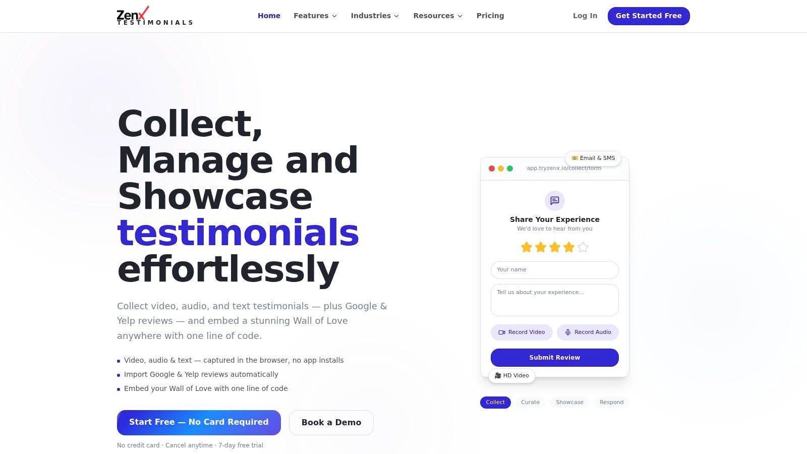
They assume every customer wants to type, has the time to type, and is comfortable typing on a phone. In real usage, that's not how people behave. According to Clipform's article on customer feedback forms, up to 40% of customers abandon text-only forms on mobile due to typing difficulty, and offering audio or video options can increase completion rates by 25 to 30%. The same source notes that frictionless in-browser recording without a login is the single biggest predictor of video testimonial success.
When speaking is easier than typing
This matters most in a few common cases:
- Mobile-heavy audiences who are responding from email, SMS, or a QR code
- Customers with detailed experiences that are hard to compress into one text box
- Non-native English speakers who can explain themselves more naturally by voice
- High-emotion moments, positive or negative, where tone adds context you won't get from a typed sentence
A typed response like "support was slow but helpful" tells you something. A voice note often tells you what happened, where frustration started, and which moment changed the customer's perception.
Multi-modal forms reduce the wrong kind of friction
Not all friction is bad. Some friction improves quality, like asking one clarifying follow-up. The bad friction is mechanical. Login walls. App downloads. File uploads. Device permissions that feel complicated. Tiny text areas that invite a one-word answer.
A modern customer feedback form should let the respondent choose the easiest format for them:
- Text for quick, structured input
- Audio for convenience and nuance
- Video for richer testimonials and clearer emotional signal
If you're evaluating tools that support this approach, smart feedback forms with video, audio, and text capture are worth looking at because they remove the need to push customers into a single response format.
The old model asked customers to adapt to the form. The better model adapts the form to the customer.
Where rich-media feedback works best
Video and audio aren't necessary for every workflow. They are especially useful when you need detail, authenticity, or reusable proof.
Good use cases include:
| Use case | Best format | Reason |
|---|---|---|
| Post-purchase delight | Video or audio | Captures emotional reaction naturally |
| Product onboarding feedback | Audio | Faster than typing feature impressions |
| Service reviews | Video | Strong social proof if permission is granted |
| Bug or friction reports | Text plus optional audio | Structured issue logging with room for explanation |
The trade-off is moderation. Richer input creates richer review work. That's manageable if your workflow includes triage, tagging, and analysis. It becomes messy when teams collect media with no plan for processing it.
Deploying Your Form for Maximum Response Rates
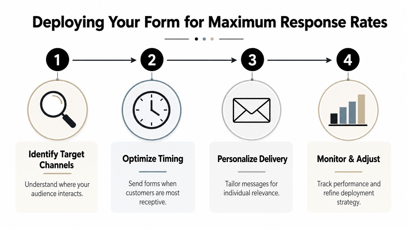
A good customer feedback form sent at the wrong time underperforms a decent form sent at the right time.
Timing matters because memory decays fast. So does motivation. The strongest feedback arrives when the experience is still fresh and the customer can connect your questions to a specific action they just completed. According to Nielsen Norman Group's guidance on user feedback, feedback forms perform best immediately after a user completes a real task. The same guidance recommends starting with a single overall rating question, then 2 to 3 specific ratings, and ending with one open-ended question.
Match the channel to the moment
Different channels fit different contexts. The mistake is choosing a channel because it's convenient for the business instead of natural for the customer.
My perspective is this:
- Email works well after purchases, support tickets, and onboarding milestones, especially when the customer expects follow-up.
- SMS fits short requests when speed matters and the audience is highly mobile.
- QR codes make sense for physical products, packaging inserts, retail counters, clinics, events, and service businesses.
- In-app or on-site prompts work after a clear task completion, not in the middle of browsing.
If you need examples of channel-specific collection workflows, this guide on how to get customer feedback across different touchpoints is a useful reference point.
Write the invite like a human
The request message does a lot of hidden work. If it sounds automated, vague, or demanding, people ignore it. If it sounds relevant and easy, more people start.
A simple message usually works best:
We'd love your feedback on your recent order. It takes less than a minute, and your input helps us improve the experience.
For support:
Thanks for contacting support. Could you rate the interaction and share anything we could improve?
For product use:
You just finished setup. How did it go? A quick response helps us smooth out onboarding.
Use placement and sequencing carefully
The form should appear when the user has enough context to answer and enough breathing room to respond. That sounds obvious, but many teams still ask too early, too late, or too often.
A few practical deployment rules:
- Send after completion, not during effort. Don't interrupt checkout to ask about checkout.
- Tie the form to one event. Order delivered, ticket closed, setup completed, appointment finished.
- Keep follow-up optional. If you need contact details, ask at the end.
- Monitor drop-off by step. If people start but don't finish, the issue is usually layout, effort, or wording.
The best deployment feels like a continuation of the experience, not a separate campaign.
Turning Feedback into Actionable Intelligence
Often, the problem isn't one of collection. It's an interpretation problem.
They gather ratings, comments, screenshots, voice notes, and review snippets from different places, then leave everything in raw form. That's where customer feedback programs lose momentum. According to Digital Leadership's discussion of underserved customer needs, 70% of companies collect feedback, but most fail to act on it because of manual analysis bottlenecks. The same source says AI tools that auto-extract themes and quotes can reduce review time by 50%.
What manual review gets wrong
Manual analysis isn't useless. It just doesn't scale well once responses start coming in from multiple channels.
Teams usually hit the same issues:
- Open-text answers pile up faster than anyone can read them carefully
- Important comments get buried under repetitive ones
- Different people categorize feedback differently
- Strong quotes for marketing or case studies are hard to retrieve later
That creates a weird situation where the richest feedback becomes the least usable.
Raw feedback has no value on its own. Teams create value when they turn recurring comments into decisions, priorities, and publishable proof.
Build an analysis workflow, not a folder
A workable system needs structure after submission. Not just storage.
At minimum, your process should answer four questions:
| Question | What to look for |
|---|---|
| What themes keep repeating? | Onboarding, support speed, pricing clarity, missing features |
| What sentiment clusters appear? | Frustration, delight, confusion, trust |
| Which comments need action? | Bugs, service failures, feature requests, churn risks |
| Which responses can be reused? | Testimonials, review snippets, proof points for landing pages |
AI offers the most help in this area. Not by replacing judgment, but by doing the first-pass sorting that humans are slow at doing consistently.
Use AI for extraction, then let humans decide
A strong workflow looks like this:
- Collect structured and unstructured feedback together so ratings have context.
- Auto-group responses into themes instead of reading every line from scratch.
- Pull cited answers and candidate quotes for product, support, and marketing teams.
- Route findings to owners so someone is responsible for acting on each pattern.
Tools that support AI review analysis with theme extraction and quote pulls can speed up this stage, especially when you're handling mixed text, audio, and review data.
The important trade-off is transparency. AI summaries are useful, but teams still need access to original responses. Don't let a dashboard flatten everything into generic sentiment labels. You want synthesis, not abstraction.
Keep one source of truth
The operational mistake I see most often is fragmentation. Product has survey data. Support has ticket comments. Marketing has testimonials. Local teams watch Google or Yelp reviews separately. Nobody sees the whole picture.
A better setup brings those streams into one review process with shared tags, approval states, and searchable themes. That helps product spot friction, support spot service issues, and marketing find credible proof without pulling from different systems every week.
Closing the Loop and Showcasing Social Proof
The best customer feedback form doesn't end at submission or analysis. It ends when customers can see that their input changed something.
That can be as simple as a follow-up email explaining a fix, a changelog note that references customer requests, or a support message acknowledging a pattern you addressed. Customers don't expect every suggestion to become a feature. They do expect evidence that someone read what they sent.
Close the loop with specificity
Generic thank-yous are polite, but they don't build much trust. Specific follow-up does.
A few examples:
- Product teams can notify users when an onboarding issue has been simplified.
- Support teams can acknowledge repeated complaint themes and explain the process change.
- E-commerce brands can tell buyers when shipping communication or packaging instructions were improved based on feedback.
That kind of response turns the form from a one-way request into a two-way relationship.
Turn positive feedback into proof
There's a second payoff here. Strong feedback can become public trust assets if the customer has granted permission. Text quotes work. Audio clips work. Video often works even better because buyers can hear confidence, hesitation, relief, or excitement in a way that polished copy can't fake.
Adding social proof near conversion points matters. FormAssembly's advice on optimizing form conversion rates notes that elements such as testimonials, security badges, or usage statistics near the submission area can improve trust and safety perception.
The practical move is to treat positive responses as reusable assets. Moderate them, tag them by use case, and publish them where they support real decision moments such as landing pages, pricing pages, product pages, and service pages. That closes the loop internally and externally. Customers feel heard, and prospects see credible proof from people like them.
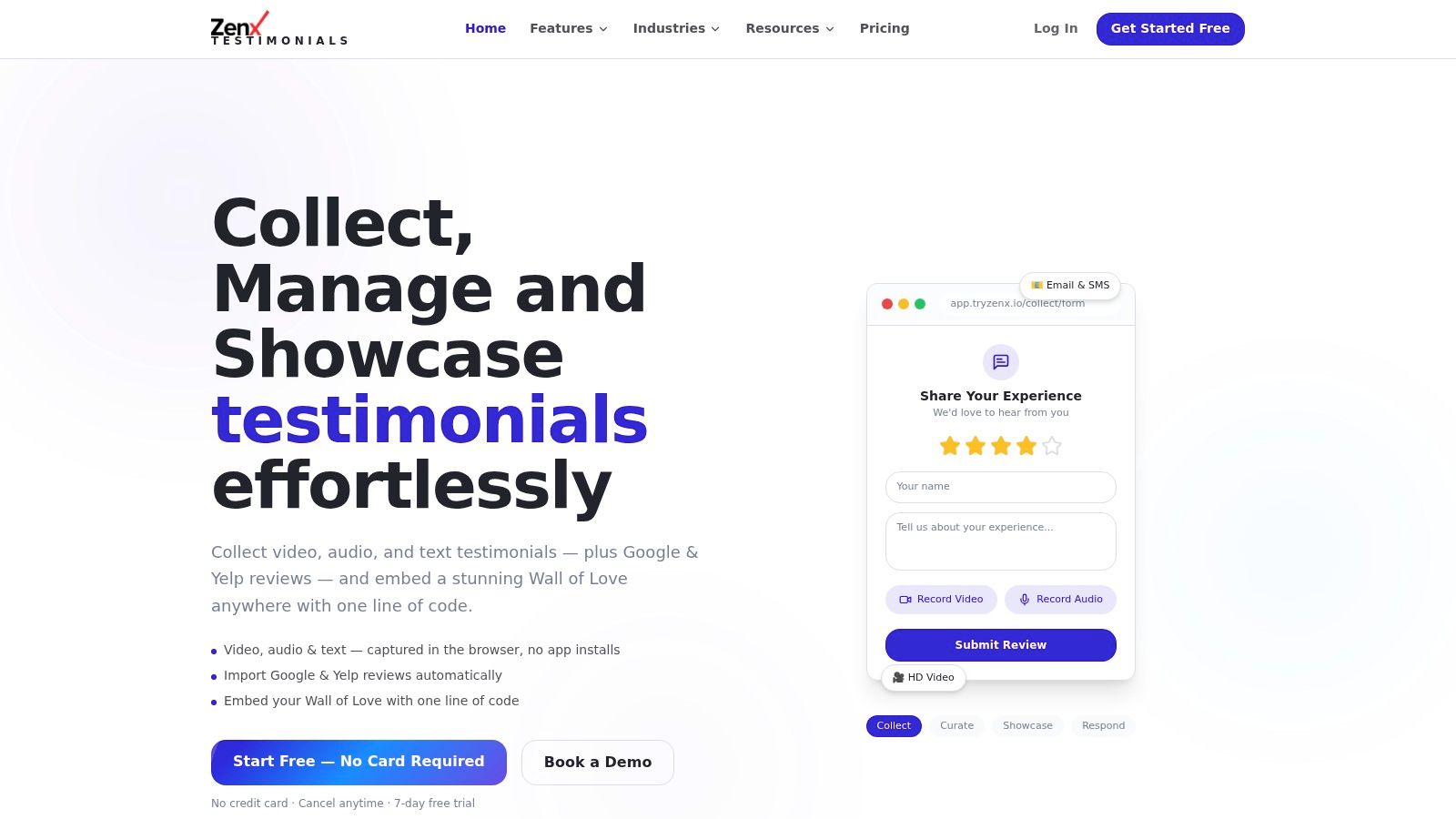
If you want one system for collecting video, audio, and text responses, organizing them, and publishing approved feedback as social proof, ZenX Testimonials is built for that workflow. It combines browser-based capture, no-login submission, moderation tools, AI-assisted review insights, and embeddable testimonial displays so your customer feedback form can feed both product learning and conversion-focused trust signals.
Written by
Sunil
ZenX Testimonials
Sunil writes about reviews, testimonials, and the everyday work of earning customer trust.